Complete Mobile Optimization Guide
From July 2019, Google switched to mobile-first indexing. This means it will use a mobile version of the document to assess the quality of the page. Therefore, if some of the content is not available for mobile, it is very likely that it will not be considered for ranking.
Hence the first rule: all content from the web version must be available on mobile.
The second key event took place in June 2021—Google’s Page Experience update that uses Core Web Vitals metrics to measure page loading speed, page interactivity, and layout stability.

After the Page Experience update, pages that meet the quality criteria get more impressions in search and, subsequently, more clicks. And vice versa—pages with low scores rank worse as they provide users with a poor user experience. To emphasize the impact of Core Web Vitals on rankings, Google Search Console added the Page Experience report based on these metrics.
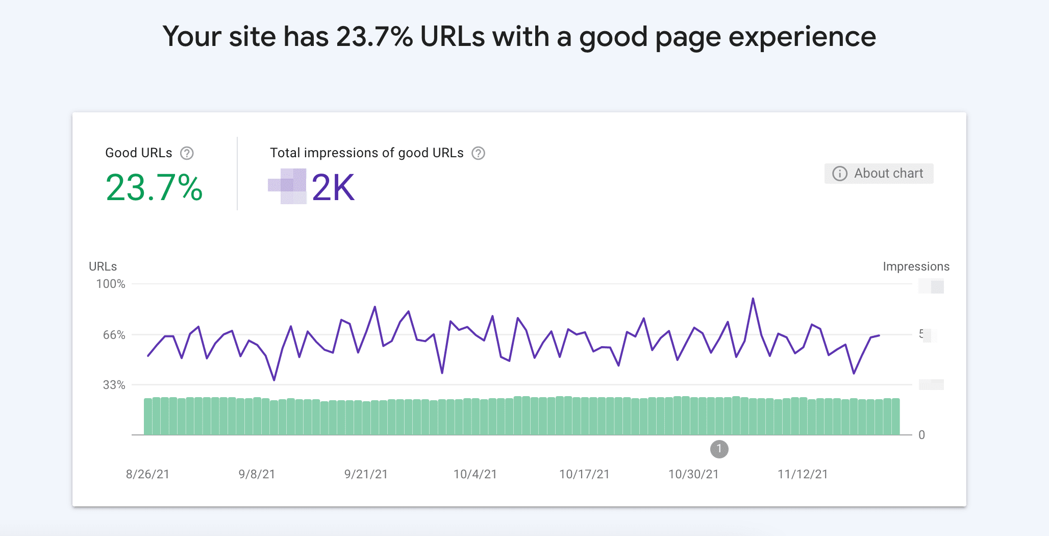
Hence the second rule: the page must meet the Core Web Vitals green zone parameters.
Optimization of pages for mobile devices is built around these two principles. But let’s start from the very beginning and find out how to create a page for a mobile device.
How to implement responsive design
History of mobile layout
In the beginning of mobile Internet, a common solution was to create a separate version of the site on the m.domain.com subdomain with all pages adapted for mobile devices. This was done due to technological limitations—the CSS functionality did not allow making one page that could be optimized for all screen types and sizes at the same time. Furthermore, some large sites had a problem with a high workload. Being a separate channel for mobile users, the subdomain took over some of the traffic and distributed the load more evenly.
The problem with this approach is that Google considers subdomains as separate sites, which can cause problems with the promotion of such pages.
Among the few remaining examples of websites using the subdomain approach is m.youtube.com. It remains active because it became a separate product designed specifically for mobile devices. As a result, it has no problems with SEO: its backlink profile is very strong despite Google’s attitude to subdomains. This means you should not use subdomains for a mobile version unless you are Youtube.
Technical solutions for creating a responsive web page
CSS and HTML allow you to do things like 3D animations, which were unthinkable 10 years ago. So creating a single page for all devices should not be a problem at all. The most popular tool for this is @media queries. For example, the properties following this request will only be applied for screens up to 600px wide.
@media only screen and (max-width: 600px)
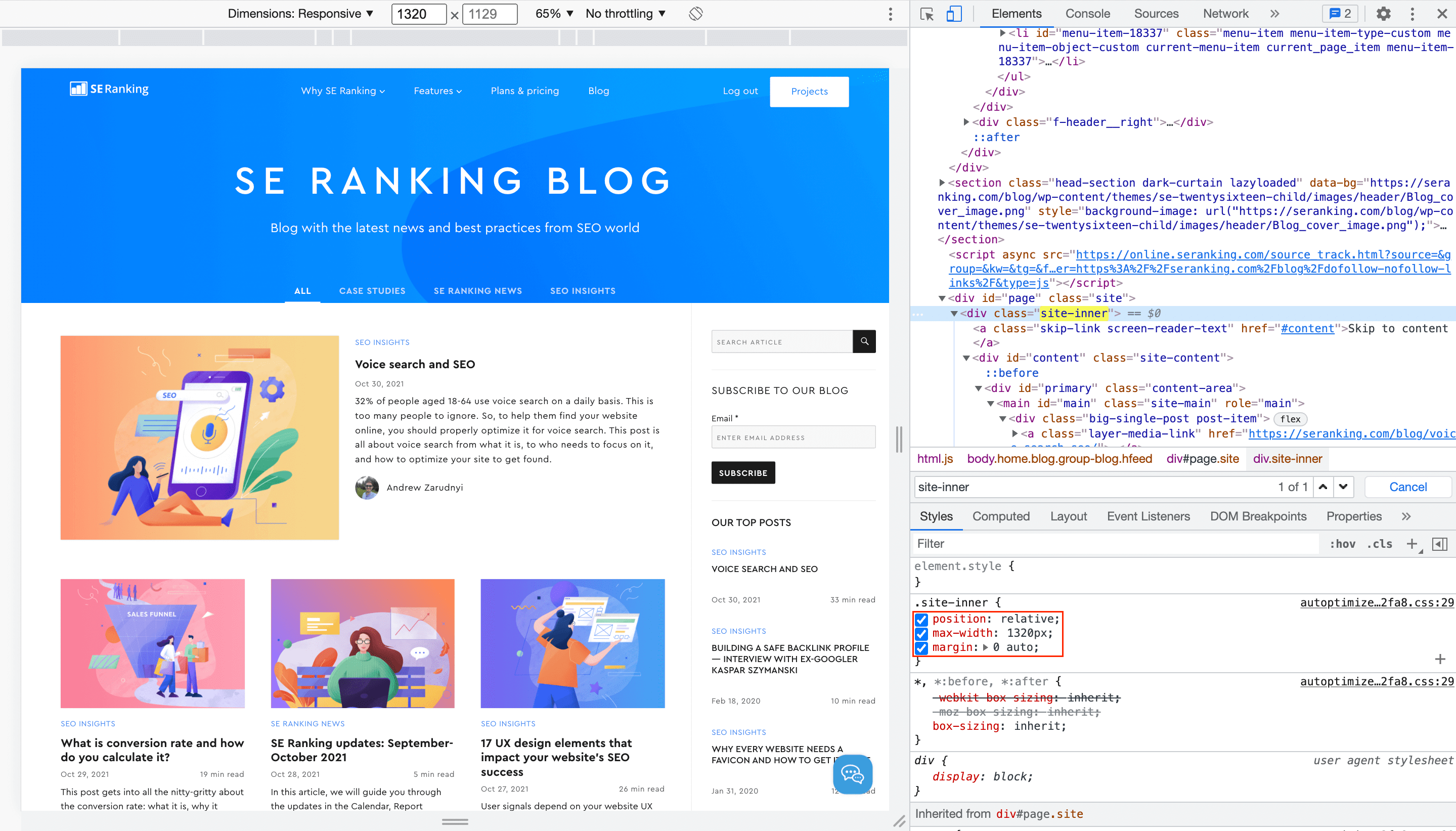
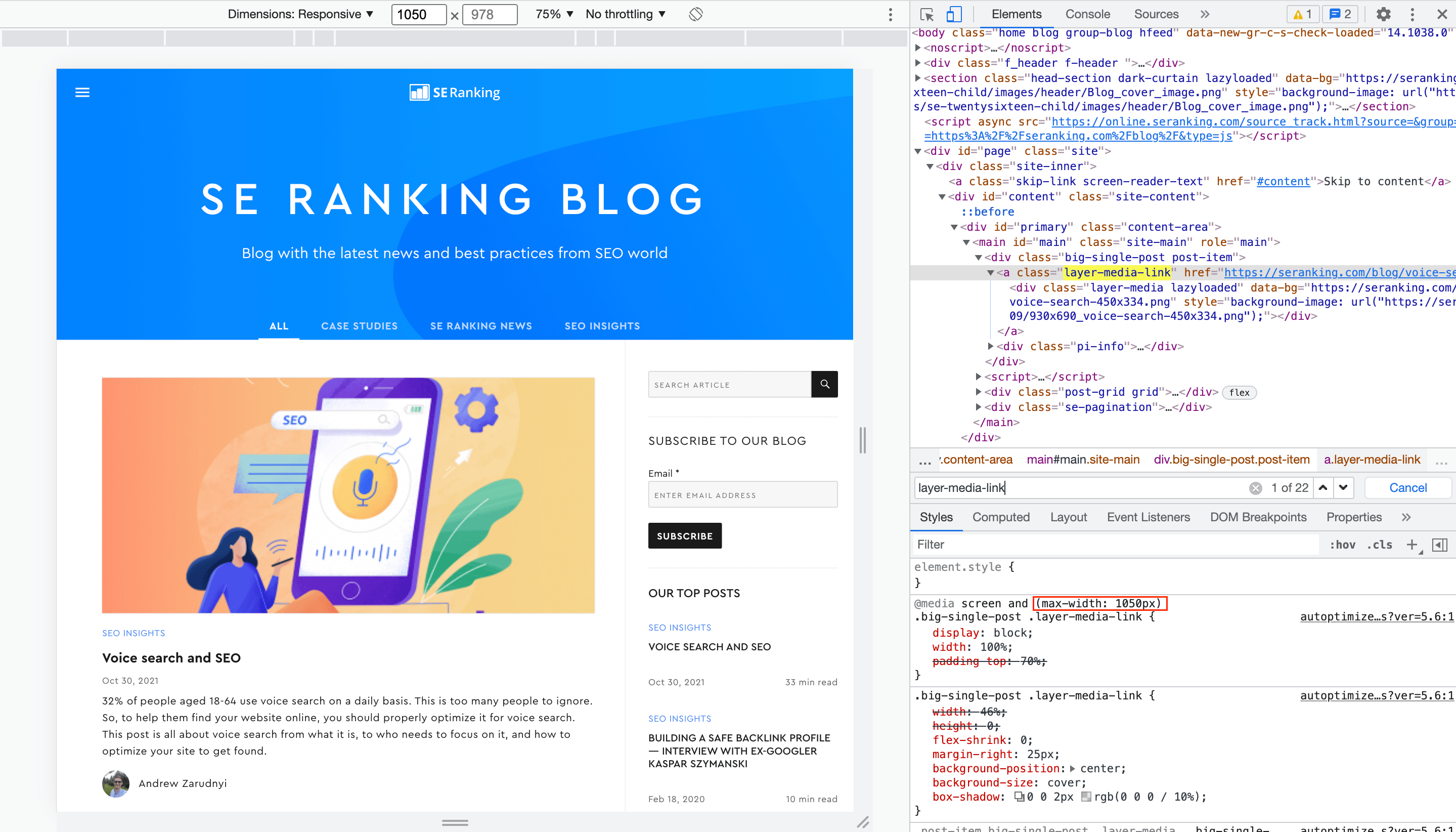
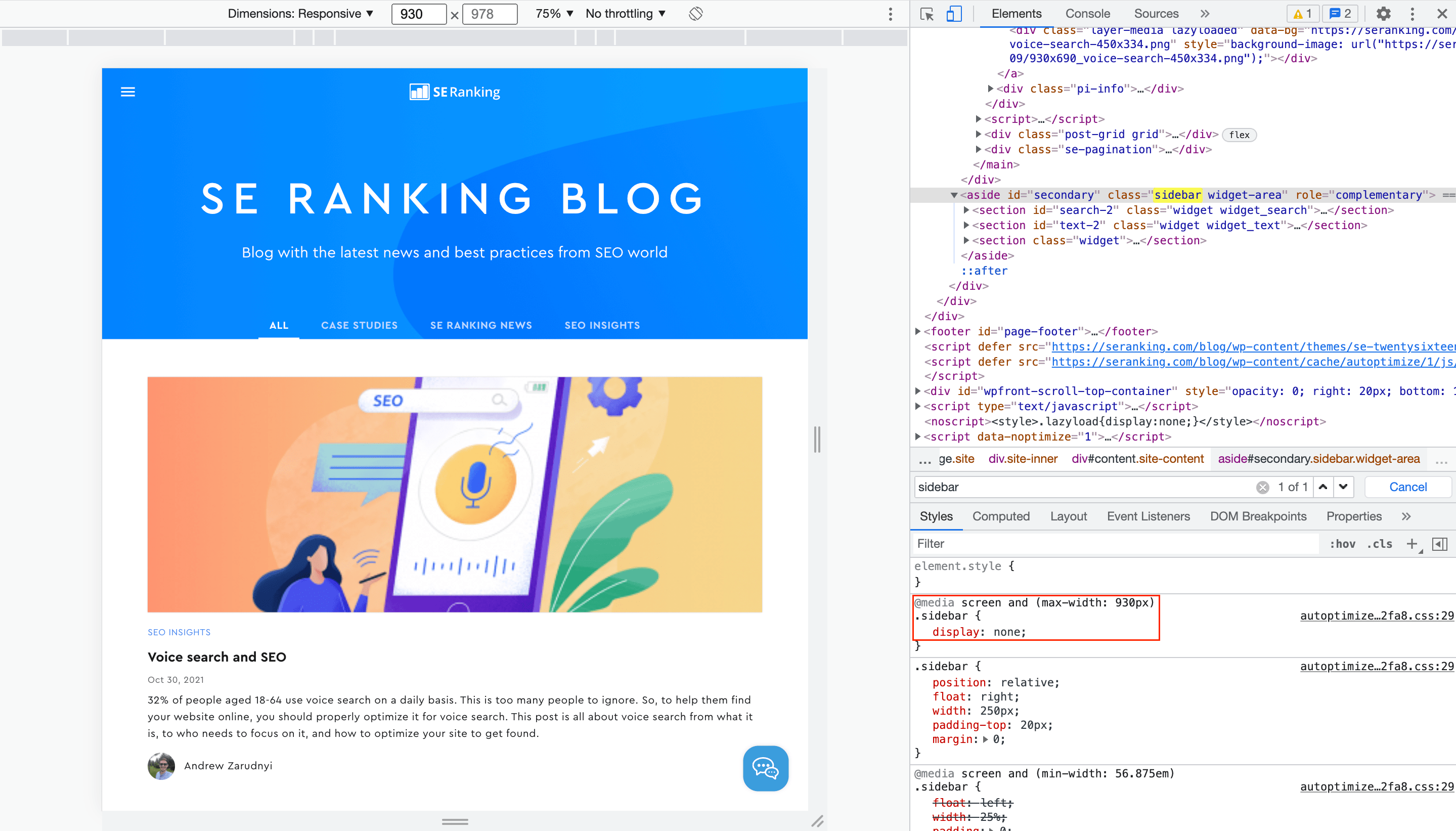
An adaptive layout is created by a series of such requests. Let’s take a look at the SE Ranking blog homepage.
- The maximum width of the main content is set to 1320 pixels:
- The next limit is 1050 pixels. This time the preview of the first post changes:
- After that, at 930 pixels, the sidebar becomes hidden:
- At 600 pixels, the width of subsequent posts is calculated differently, and all posts become aligned in one column:
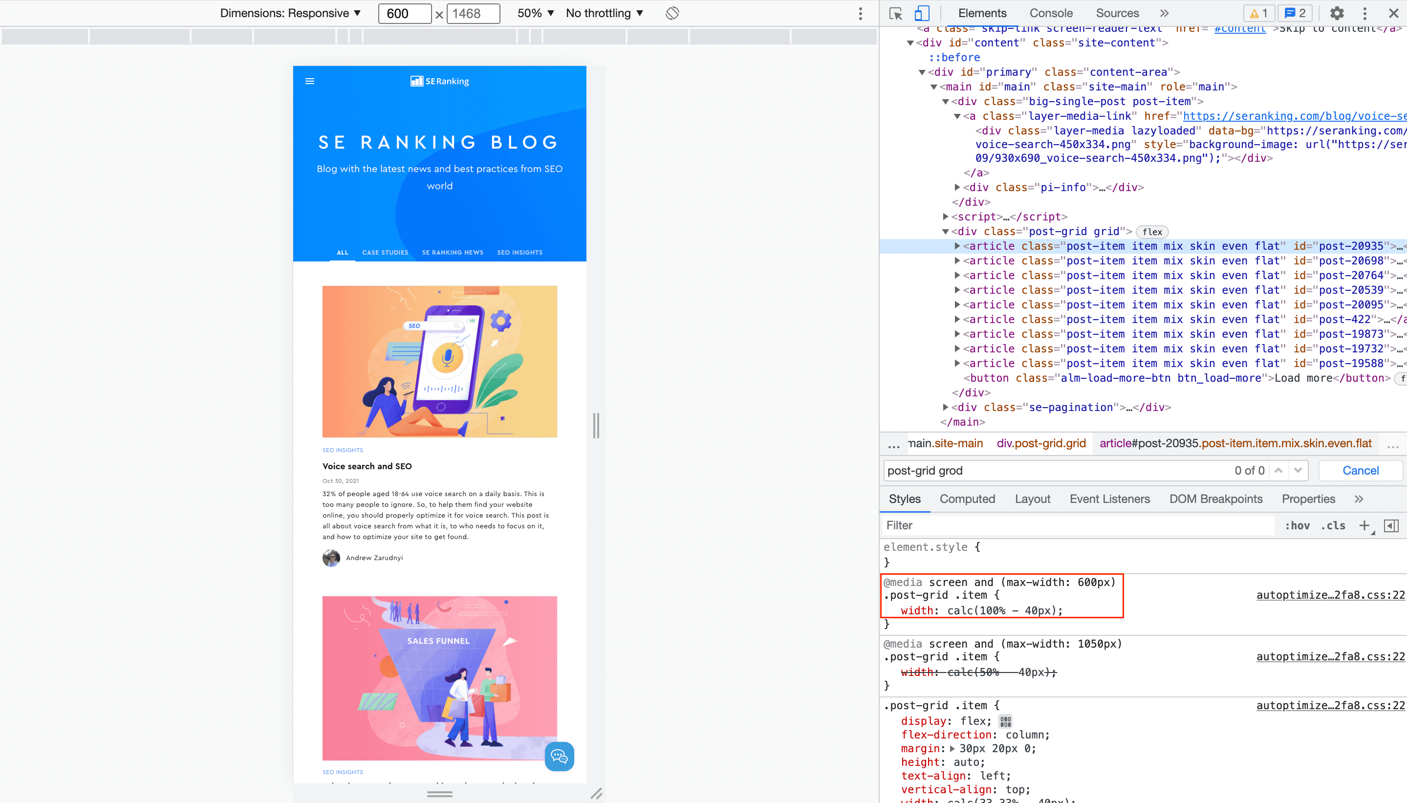
This is the final look. If you decrease the screen width further, the size of the elements will proportionally change, but their arrangement will remain.
Thus, for any screen width, be it 3000 or 300 pixels, the content will be accessible and readable, and this is what responsive design is for.
To apply a responsive layout on your site, you need to:
- Experiment with the width of the page to understand at what width your content starts shifting
- For each of these widths, write separate properties in the CSS file via @media
Don’t forget JavaScript
If you have JS scripts on your site, you need to add the appropriate events for mobile devices. For example, the common mouseup event will not work on mobile because it cannot be clicked on. The phone screen can be touched, so the equivalent for mouseup is touchend. The latter should be added wherever mouseup was used.
Optimization of mobile layout
If you apply responsive design, then your site will look great on any screen size, whether it is a 4K TV or an iPhone 5 with a screen width of 320px. But the optimization work does not end here. As mentioned earlier, another important challenge is to get good Core Web Vitals results.
How to check Core Web Vitals metrics
SE Ranking’s Website Audit lets you easily check how well any page is performing against Core Web Vitals. In the Overview section, you can see the site’s health score and the Core Web Vitals measurements on a scale from critically bad (red) to needing improvement (yellow) and good (green). Since these metrics differ for desktop and mobile, click on the mobile device icon to check how pages are optimized for mobile.
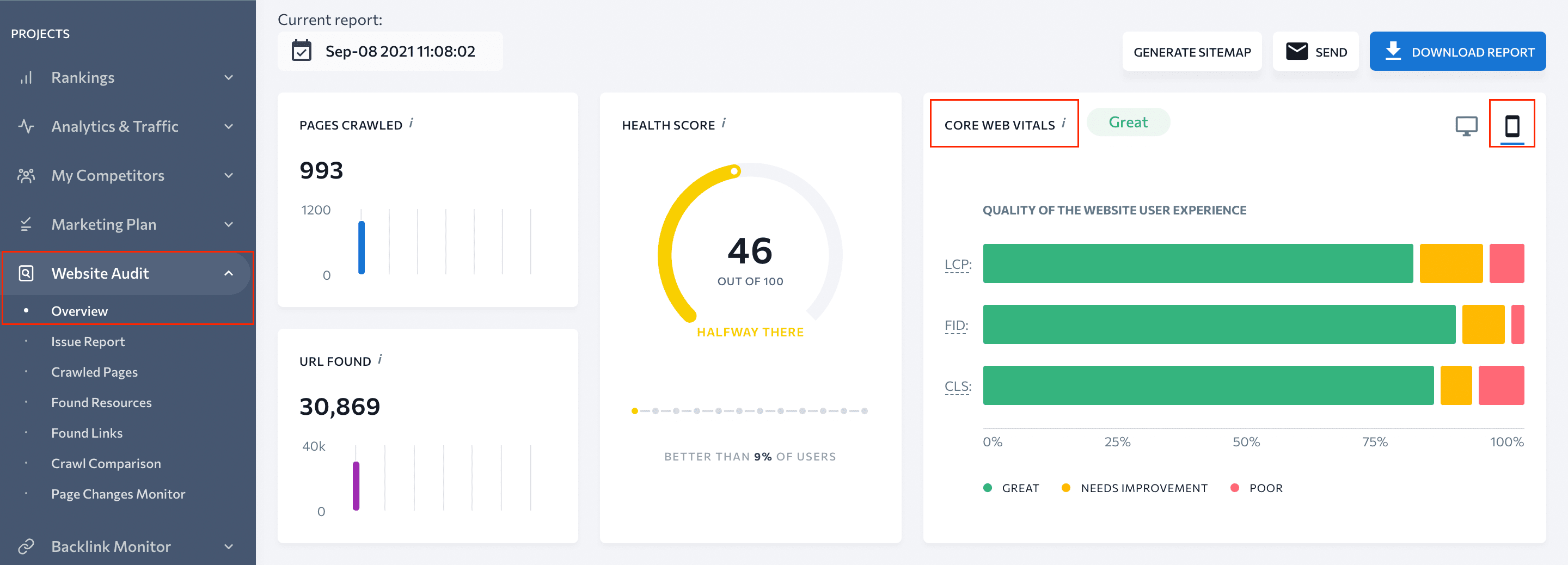
Enable regular automatic website audits to monitor these indicators and detect possible problems in a timely manner.
Core Web Vitals metrics are primarily aimed at providing a better user experience on the website. If users are satisfied with how they navigate through a page, they are more likely to click on CTAs and convert. Behavioral factors are closely related to rankings.
How to improve your page usability scores
You should follow all the recommendations provided by web.dev. Below is a summary of the most effective and simplest ways to improve your performance.
Loading speed
Core Web Vitals have fundamentally changed the approach to assessing the website’s loading speed—after all, the first render of the screen, and not the entire page, must become available as quickly as possible. Many principles that are important to optimizing a website’s overall speed may also help improve Core Web Vitals.
Server
If the server is slow, no further improvements will help. Take care of this first.
Caching and minification
Caching is used to prevent the server from sending requests to the database every time the page is loaded. A pre-rendered HTML document is loaded instead, which is much faster.
Minification removes spaces, newline characters, tabbing, etc. Each of these characters takes 1-2 bytes, but in total, they can significantly decrease the page loading time. There are many tools for minifying CSS and JS—for example, freeformatter.com.
Image size
You do not need to use FullHD for screens with a width of 400 pixels—you will not be able to see the difference, but the page size increases significantly. If you are using a popular CMS (for example, WordPress), it offers various ready-made solutions to automatically adjust the size of images to screen resolution.
Lazy loading
This technology prevents images on a page from loading simultaneously. Instead, they will load gradually as you scroll the page. As a result, the loading time of the first screen is significantly reduced, which is important for good LCP (largest contentful paint) measurements.
Accessibility
Contrast
The text color should be sufficiently different from the background so that users can read it without straining their eyes. You can measure the contrast level in the browser by hovering over the text color in the Chrome Dev Tools console.
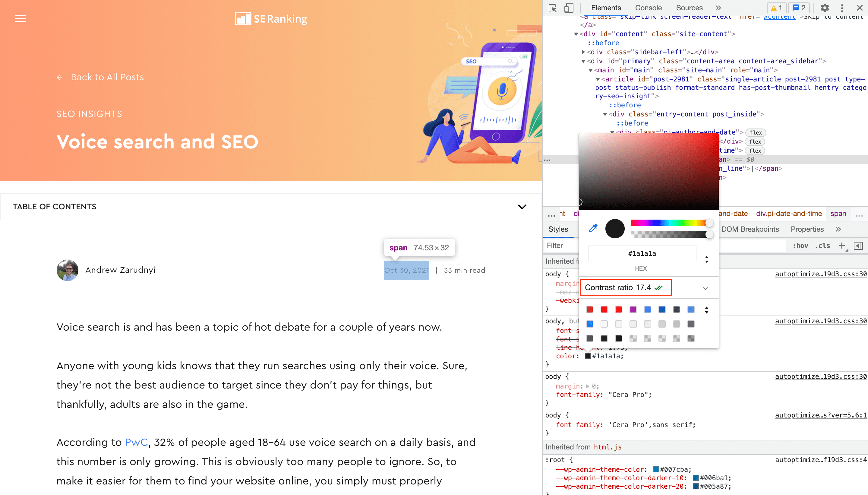
For large text elements like headings, the contrast should be more than 3, and for the rest, more than 4.5. This is critical for mobile devices.
Font size
Just like the contrast, the font size should not make the text difficult to read. The font size should be no less than 14-16 pixels.
Size of interactive elements
Buttons, text entry fields, checkboxes, links, and other interactive elements must be large enough for users to easily hit them with their fingers.
Bonus tips
Avoid display:none for content
For example, in the SE Ranking blog, the sidebar is hidden when it no longer fits on the screen. Since it is not related to the content of the page, it is acceptable. But if the block is important, move it to the bottom of the page instead.
Use flex or grid layout
Although these types of layouts appeared recently, they are already in widespread use. This is partly because they are excellent for responsive web pages.
With the correct settings, the Flex layout will move the blocks that exceed the container to a new line. Thus, for the mobile version, you just have to set the width of the container and the float element. Another great feature of a flex container is the ability to change the order of items inside it.
The Grid layout, as the name implies, turns the container into a grid. You set the number of columns and rows in the table, as well as their sizes. For mobile devices, you need to adjust these parameters to adapt the view to a smaller screen (for example, go from 4×2 to 2×4).
Use Schema markup
Rich search results already support over 30 different types of content. If your page matches one of them, use the Schema.org markup to get the required elements and appear in the related blocks in search results.
Stop using Flash
If for some reason you still use this technology, immediately abandon it. It is not because there are more advanced options—Flash is not supported anymore and simply does not work.
Don’t forget about tablets
Although tablets comprise the smallest share of mobile devices, you do not want to exclude this audience. According to statistics, tablet users spend 50% more money than smartphone users, and 20% more than PC or laptop users.
Compress images
The size of any image can be reduced without changing its dimensions or quality. This is achieved by simply reducing the number of colors. There are lots of tools used to compress images, for instance TinyPNG.
Services that help with mobile optimization
- Firefox / Chrome Inspector is an essential tool that emulates device screen sizes. Select the most popular smartphones and tablets to see how your pages are seen. You can also check the contrast of the font and background colors.
- web.dev searches for technical errors and checks the page optimization for smartphones.
- Google Search Console includes a report on page loading speed. Even if you get high scores in the web.dev check, note that it is a synthetic test that may differ from reality, because not all users have a stable and fast Internet. Google Search Console takes into account real user data.
The console also has a specific report for mobile optimization—Mobile Usability:
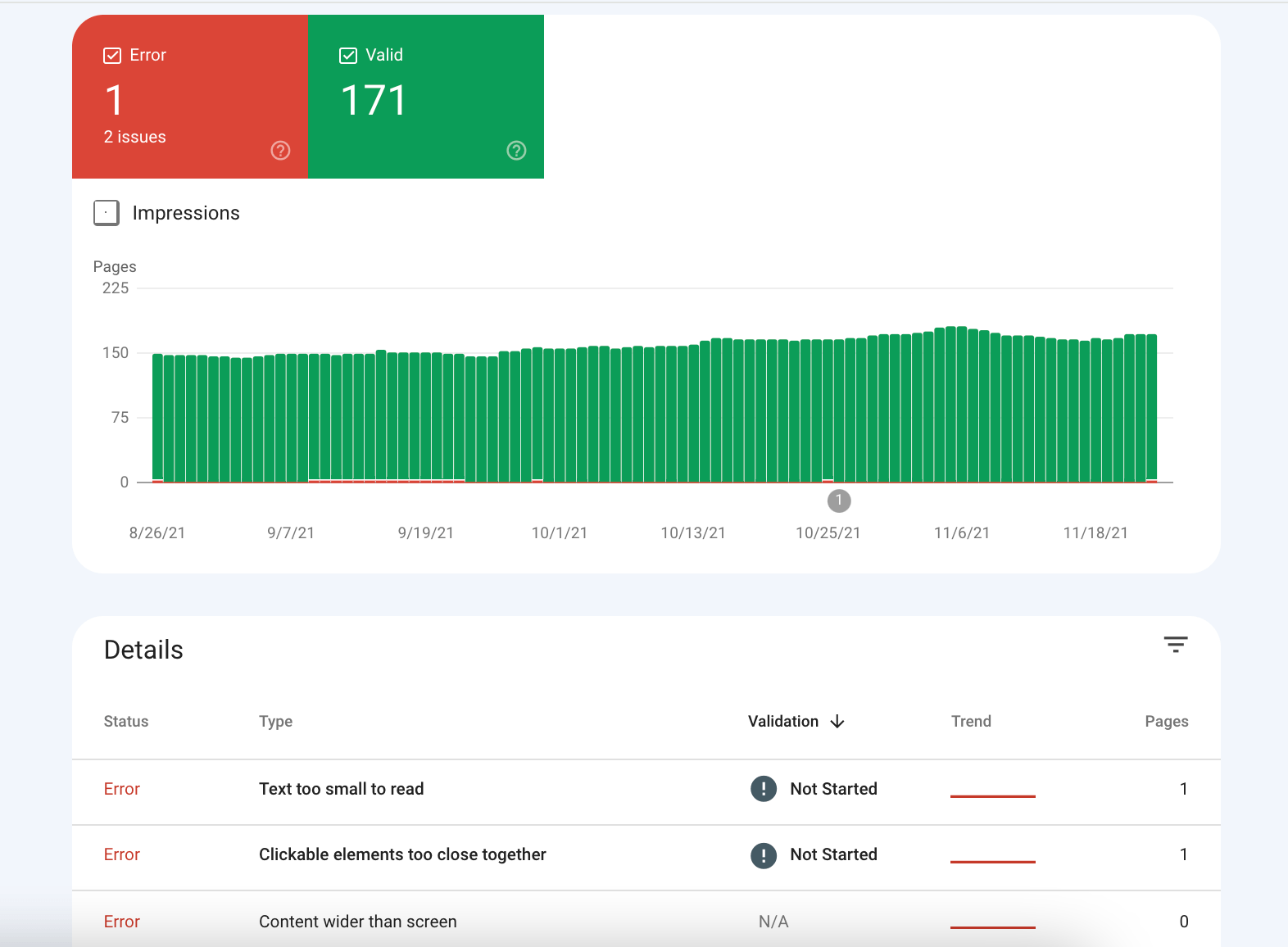
This report helps you assess the overall website’s mobile optimization and find common errors that hinder user experience and SEO.
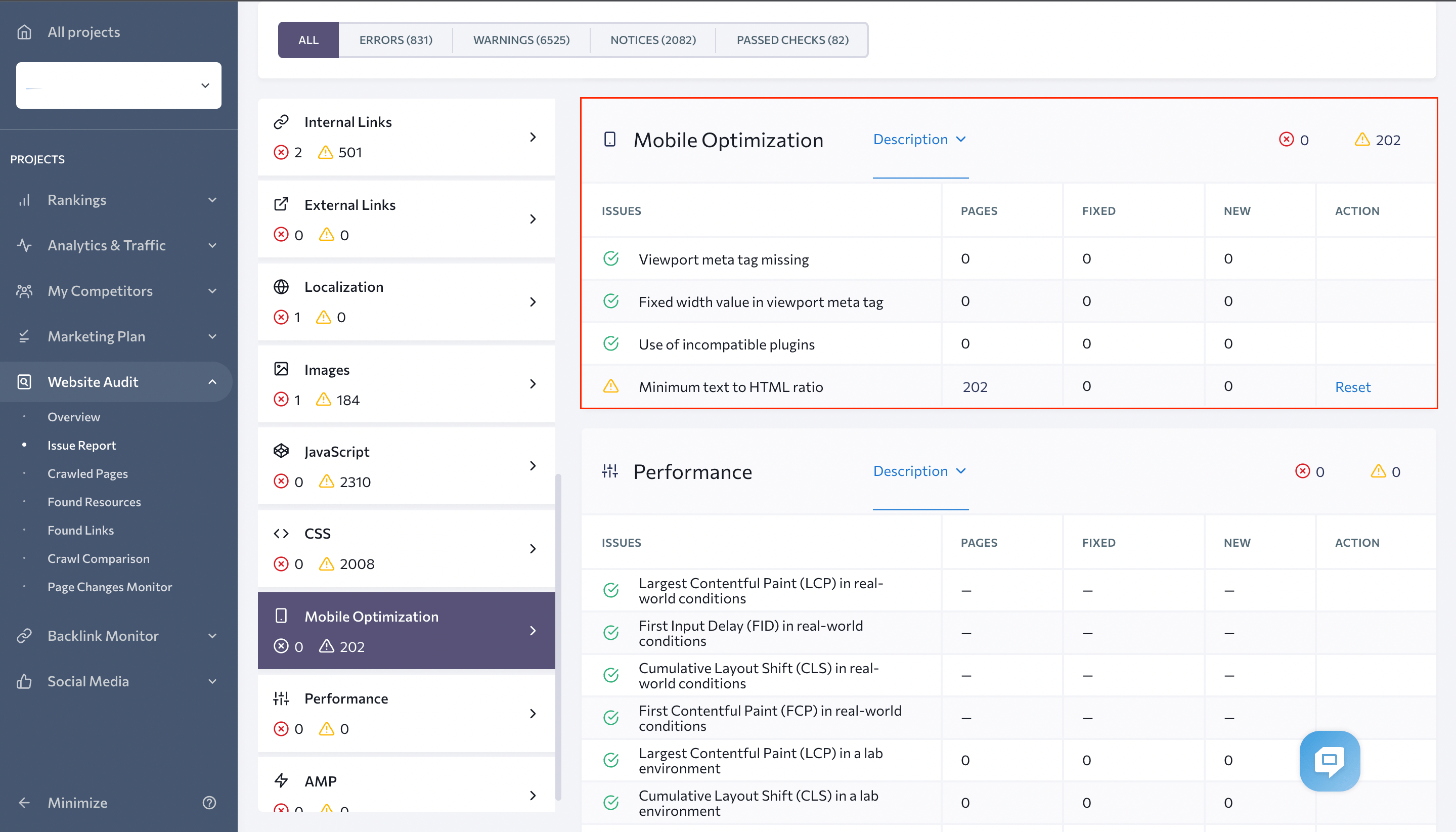
You can also use SE Ranking’s Website Audit to check for mobile optimization errors on the website. In the Issue Report section, you will see which pages have problems:
WordPress Tools
- WP-Optimize is one of the best free website load speedup plugins (do not forget to activate all features). It requires a separate plugin for lazy loading.
- Lazy Load is a simple yet effective way to apply the lazy loading technology.
- WP Rocket is the one of best paid solutions for complex website load optimization.
Conclusions
Mobile optimization has long been a must for most sites. In fact, it does not require a lot of time or super-qualified specialists, but it can significantly improve SEO and conversions.
Additionally, there are many out-of-the-box solutions that simplify the mobile optimization process. With their help, it is possible to adapt your site to mobile devices in just a week, even without any prior experience with responsive layout.
Post Views: 302

